Spendely - An expense manager for International Students
Note!
This solution is conceptual and was designed as a part of a course assignment in Masters programme in Human-Computer Interaction at Uppsala University. If you have any queries or wish to discuss about this solution please contact me through any of the social channels listed at the bottom of this page.
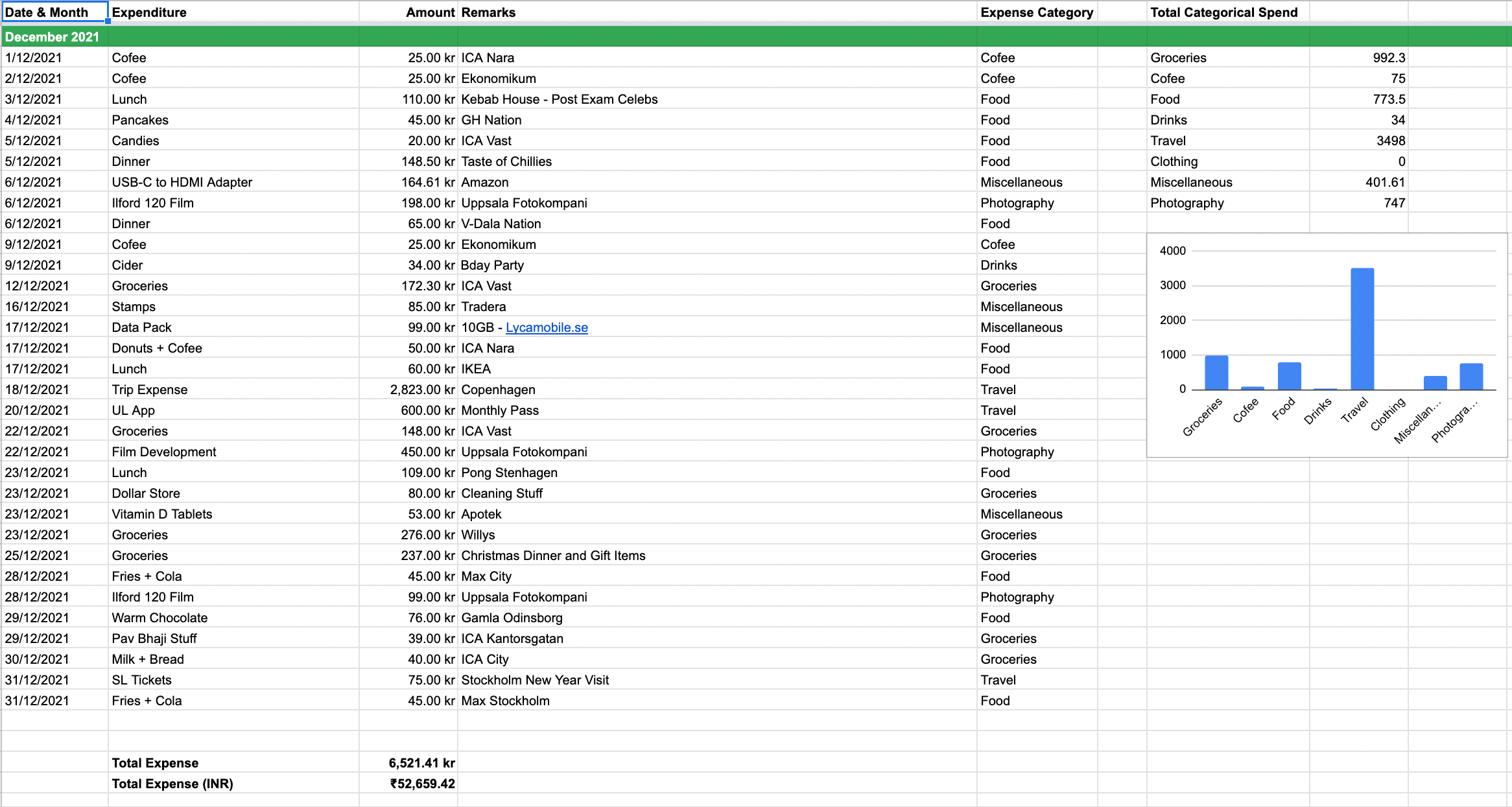
It is no doubt that money is a valuable asset. Especially for international students, who have taken hefty educational loans and spend it abroad for tuition and living expenses, every penny counts. As an international fee-paying student myself, finding an effective expense tracker has been a challenge. Browsing through the app store feels like searching a diamond in a huge mountain of gems. Thus we fall back to legacy tools like spreadsheets. A typical expense spreadsheet maintained by a student from India studying in Sweden is shown in the figure below.
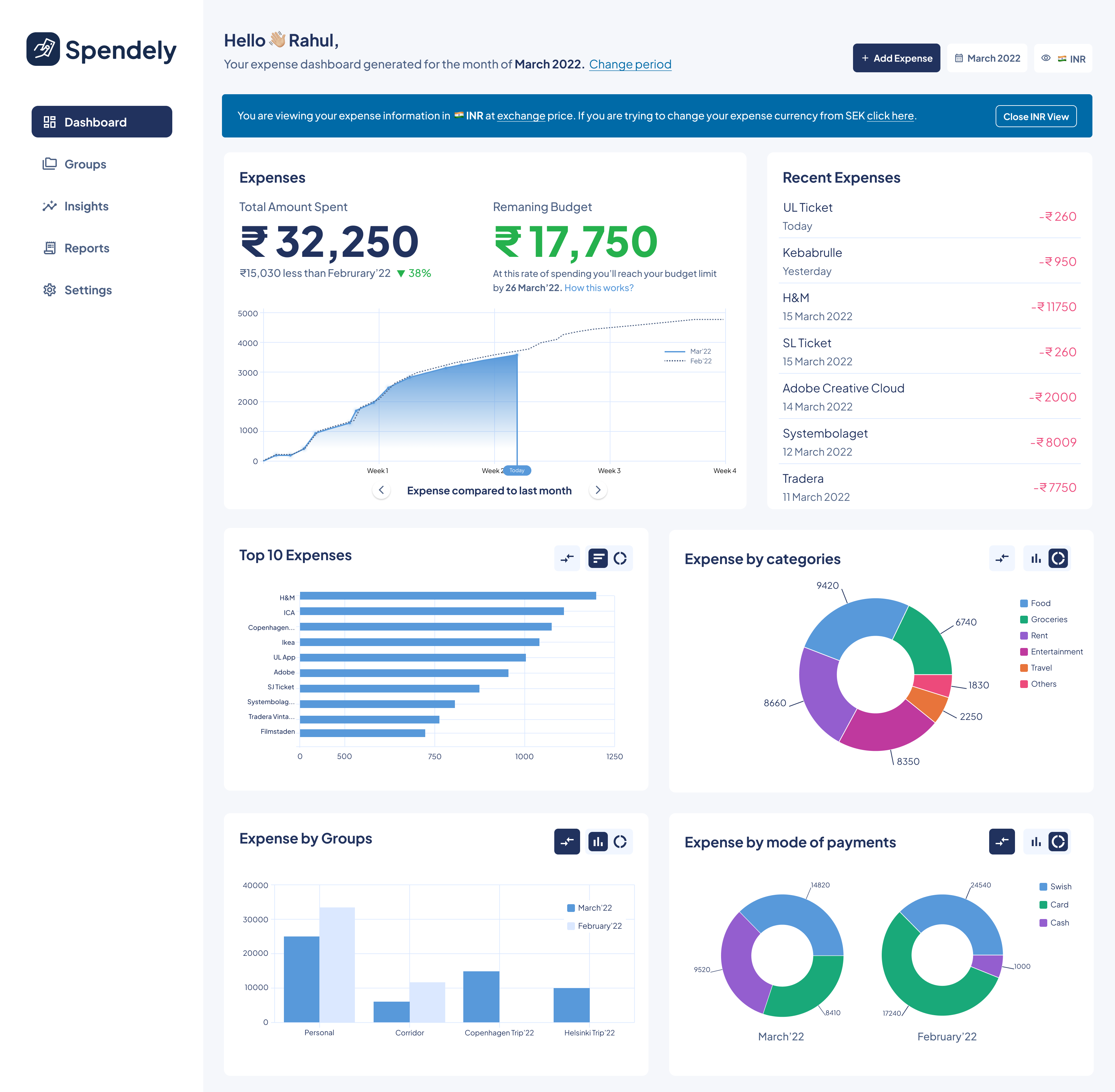
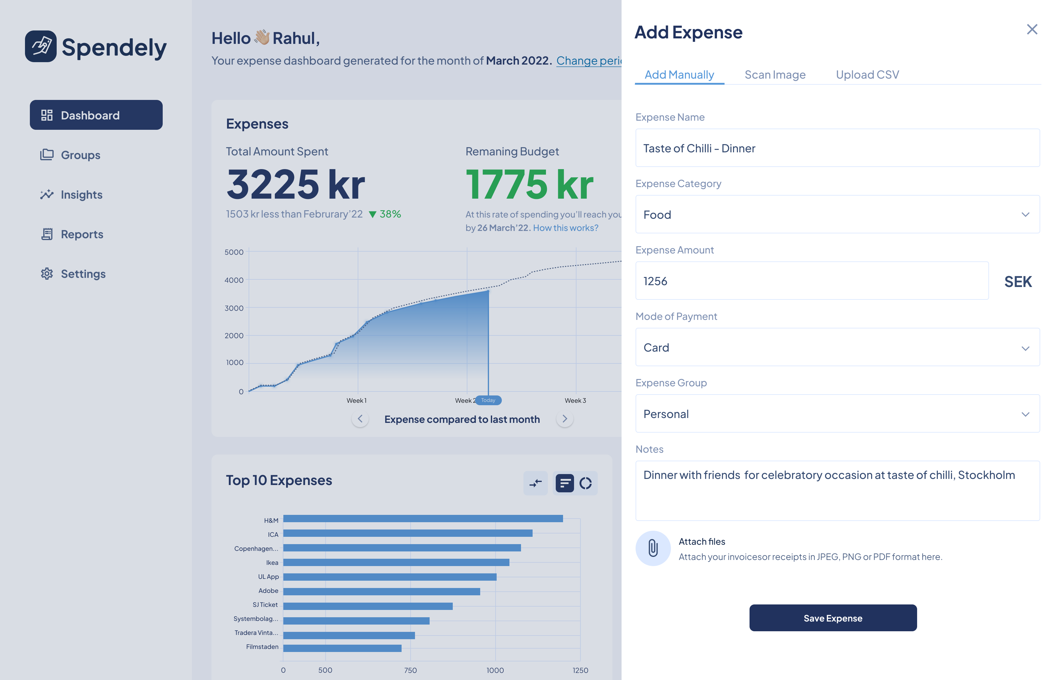
Spendely is a robust application showing spend trends, forecasts, historical comparisons, reports and insights for students to analyse their spend patterns. Students can add their home currency to view and be aware of how much they spend in their currency. The dashboard in the app is an important feature that is designed to provide an overview of their spending. Visualisations in the dashboard are generated from the expense data collected through Add Expense form.
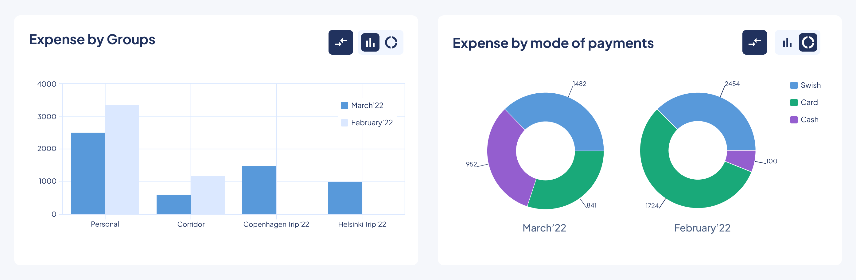
Dashboard in Figure 3 has various widgets like recent expenses, top 10 expenses, category wise split, group-wise split and payment mode wise split. These widgets are essential for a student to understand where they are spending money and how it is being spent. The primary widget “Expenses” shows the amount spend in the current month and the amount left to reach the budget limit. It tries to compare current month expenditure with previous month data. The area chart in that widget showcases the expense trend of the current month comparing it to a line chart showing the trend of the previous month. In this case, March 2022 vs February 2022. Other charts available in the carousel are
- Current Month vs Average Expense per Month
- Current Month vs Same Month Last Year
Visualisations are chosen in a way to inform the student about their spending effectively. Bar charts and doughnut charts are easy to perceive and scale well for many data points. Students can compare current month data with previous month data at individual widget level by clicking the compare icon.
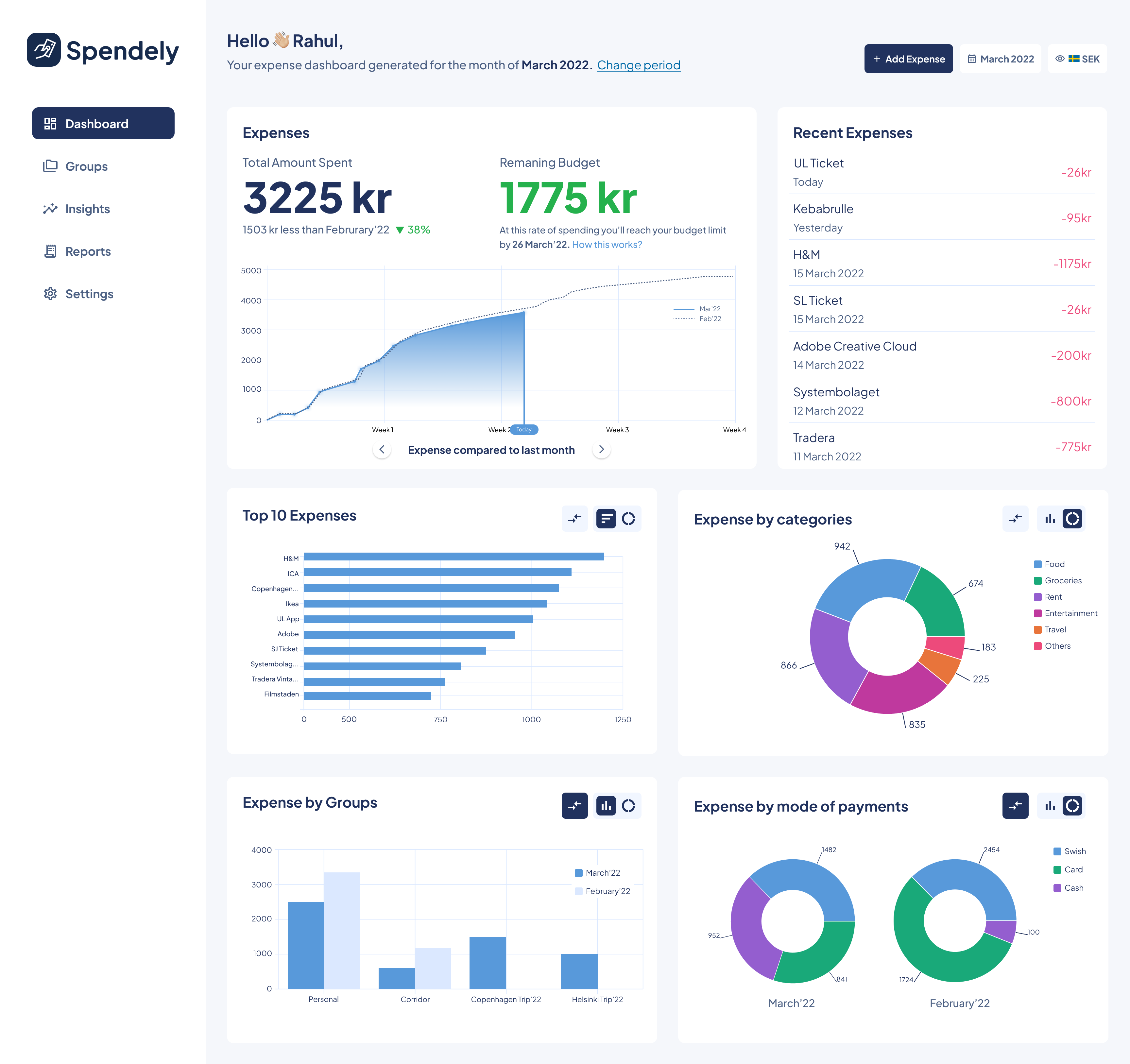
Students can also view their expense data in their home currency or currencies of their preference which they can configure under “Settings”. This view is obtained by clicking the currency selector in the top right corner. They can view the data in the exchange rate or even at the historical rate where expenses on a specific day show the home currency value of that day. Figure 5 shows the dashboard seen in INR view as set by our persona Rahul. In this case, it was assumed 1 SEK = 10 INR.